Exploring the Color Profiles: RGB, CMYK, and Pantone in Design
Explore the critical differences between RGB, CMYK, and Pantone color profiles and learn when to apply each in your designs for optimal results.
April 06, 2023 • 4 min read • Tutorials
Key Takeaways
| Aspect | Detail |
|---|---|
| RGB | Ideal for digital applications |
| CMYK | Best for printing processes |
| Pantone | Ensures global color consistency |
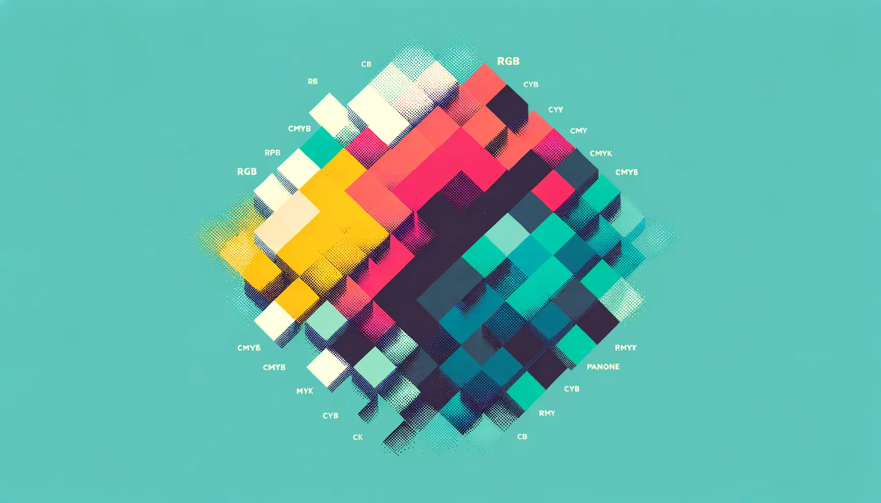
As sophisticated designers, understanding various color profiles is paramount in ensuring that our creative output resonates with its intended purpose—whether it's for vibrant digital displays or high-quality prints. At Wiredinnovator, we delve into the nuanced worlds of RGB, CMYK, and Pantone—three predominant color systems that form the foundation of our visually-centric industry.
What Are Color Profiles?
Color profiles, commonly known as color modes, define the computational approach to representing and categorizing color in designs and images. Each color system—be it RGB, CMYK, or Pantone—has its unique application and reproduction method, affecting the accuracy and vibrancy of your design across various platforms.
The Digital Standard: RGB
RGB, standing for Red, Green, and Blue, is the ubiquitous color model for devices reliant on light emission, such as monitors, cameras, and scanners. Colored light is combined in various weights to produce a broad gamut of colors, making it an elite choice for anything screen-related.
When RGB Reigns Supreme
| Use Case | Description |
|---|---|
| Digital Media | Perfect for web and video due to high color vibrancy |
| User Interface Design | Ensures great color fidelity on digital screens |
| Photography | Ideal for photos intended for digital viewing |
The Print Powerhouse: CMYK
In contrast, CMYK—Cyan, Magenta, Yellow, and Key (Black)—is the standard for print work, where colors are subtracted through ink absorption, reflecting only certain color wavelengths to the viewer's eyes. This difference is why certain colors do not translate well from digital to print without careful conversion.
Why Choose CMYK for Prints
| Reason | Explanation |
|---|---|
| Full Range | Offers a complete color range for printing purposes |
| Compatibility | Universally accepted for printing processes worldwide |
| Versatility | Works well for print materials from brochures to billboards |
Global Consistency with Pantone
Pantone is more than a color profile; it's a color standard. The Pantone Matching System (PMS) implements predefined, specific color formulas to ensure that brands maintain consistency regardless of where or how their materials are printed. This is vital for brand recognition on a global scale.
Pantone: Ensuring Brand Uniformity
- Richness in Variation: Offers traditional colors and signature tones such as metallics and neons
- Global Standardization: Guarantees the same color no matter the print shop or geographical location
- Ideal for Corporates: Crucial for brands like Coca-Cola, whose iconic red is instantly recognizable
Deciding Between Color Profiles
When tasked with choosing the appropriate color profile, we at Wiredinnovator evaluate the end medium of our design. Is the content aimed at digital platforms, or is it going to be physically printed? Maybe it's a brand message that needs consistency across all forms of media? Identifying the target medium ensures the correct color profiles are utilized for truest representation and highest quality.
The RGB Versus CMYK Conundrum
| RGB | CMYK |
|---|---|
| Light-based colors | Ink-based colors |
| Vibrant on screens | Tuned for tangible prints |
| Ideal for digital interfaces | The standard for printed materials |
Conclusion
In the intricate dance of hues and saturation, knowing when to employ RGB, CMYK, or Pantone can make or break the visual effectiveness of your design. Armed with this knowledge, we can navigate our creative projects with greater confidence, assured in our capability to deliver designs that not only look good but also feel right in their intended contexts. At Wiredinnovator, we are committed to empowering our readers with the expertise to optimize their color choices across all design endeavors.
Frequently Asked Questions (FAQ)
-
What is the main difference between RGB and CMYK? RGB is used for screen displays and relies on light, whereas CMYK is used for printing and relies on ink.
-
Can I convert my designs from RGB to CMYK? Yes, but be mindful that colors may shift, with vibrancy often reduced in the CMYK spectrum.
-
Why is Pantone important for global brands? Pantone ensures that a brand's specific colors are consistent in all printed materials, wherever they may be produced.
Remember, at Wiredinnovator, we consider context key. Design with the medium in mind—be it digital RGB, printed CMYK, or Pantone's precision—to ensure your work not only captures attention but holds it with authenticity and professionalism.